Brand
Pitangus is the great kiskadee (Pitangus sulphuratus), the bird Colombians call bichofué. It perches still on a branch, watches everything that moves and catches bugs of every kind, in the air or on the ground; it’s small and still takes on hawks far bigger than itself. That’s what we want to be for small teams: watch every change, catch what’s wrong and show it’s gone.
The brand is written Pitangus. The technical name is also pitangus: package, CLI, PITANGUS_* variables, images, container and the GitHub commit status. The GitHub repository is pitangus, in the Pitangus-Dev organization. Pitangus is made in Colombia by Arodium.
Mascot and logo
Section titled “Mascot and logo”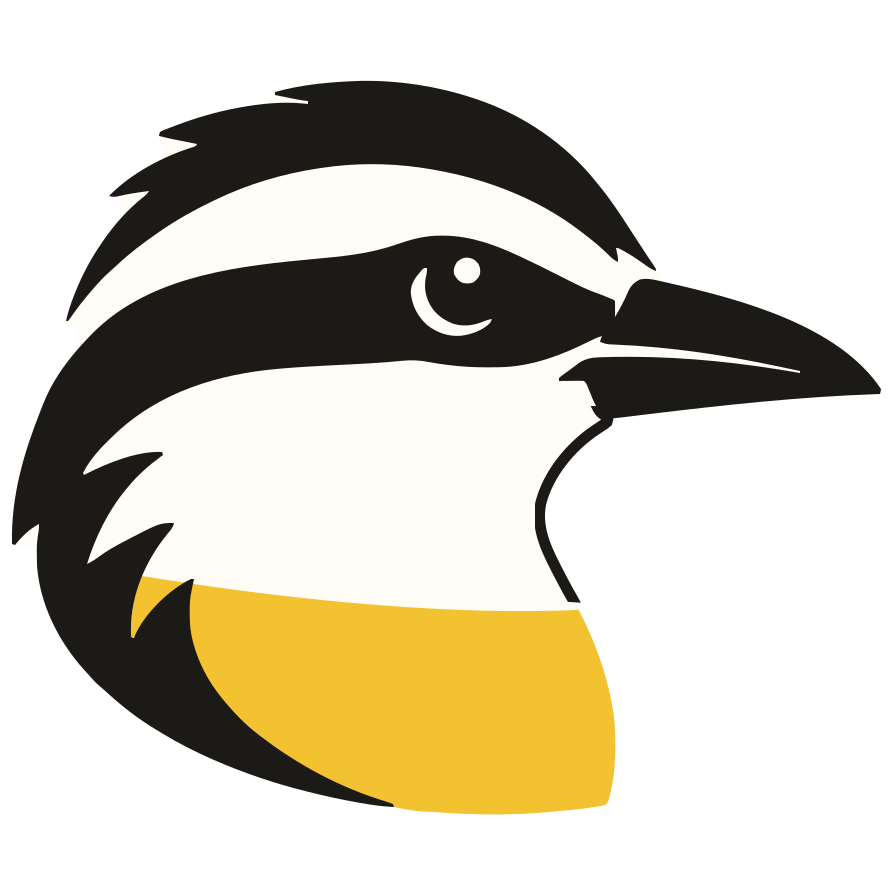
The kiskadee’s head in profile: the black mask with the white brow, the black bill and a sulphur-yellow breast. The source files are assets/pitangus.svg (the head alone, for light backgrounds) and web/public/assets/pitangus-icon.svg (the head on a cream tile: the favicon and the mark on dark backgrounds, where the black would merge with the background; the README shows its copy, assets/pitangus-dark.svg, in dark mode). In the panel they’re drawn by web/src/shared/ui/brand-mark.tsx.


- Minimum size: 16 px (favicon). Below 24 px the brow is no longer legible, but the silhouette is still recognizable.
- Don’t stretch it, rotate it or change its colors; on dark backgrounds always use the cream tile.
- Next to the name: the logo on the left and “Pitangus” in semibold, with a gap equal to a quarter of the logo’s side.
The palette comes from the bird: sulphur yellow from its breast, ink from its mask, rufous from its wings and the paper of the field notes. Yellow is a fill color, never text on light backgrounds (it fails contrast); on light backgrounds the accent for text, links and focus is rufous.
| Token | Light | Dark | Use |
|---|---|---|---|
--primary (sulphur) |
#F2C230 with ink text |
#F5CD4A |
primary buttons and fills |
--brand (accent) |
rufous #9C4A1E |
sulphur #F5CD4A |
links, selection, focus, indicators |
| Ink | #1C1A16 |
— | text on light; the mask in the logo |
| Paper / night | #FBF5E6 |
#16140F · surfaces #211E16 |
backgrounds |
| Cream | #FFFDF5 · #FFF8E8 |
text on dark | the tile and the brow in the logo |
| PDF reports | #9C4A1E on #FBF5E6 |
— | pitangus/modules/reporting/design.py |
Accent contrast: rufous 5.7:1 on cream and sulphur 12:1 on the dark background (WCAG AA for text). The accent never colors severity text or chart series: those have their own validated palette, and a severity is always shown with its label, never by color alone.
Direct, without fear or alarmism: we say what’s happening, why it matters and how to fix it. In English: plain, second person, active voice. In Spanish: neutral Latin American Spanish, tú. Each language is written for its own readers, not translated from the other (see .claude/skills/pitangus-i18n/SKILL.md).
- Headline: “Watch every change. Prove every fix.” (in Spanish, «Vigila cada cambio. Demuestra cada corrección.»).
- Tagline: “Spot it. Fix it. Prove it.” (in Spanish, «Detéctalo. Corrígelo. Demuéstralo.»).
“Prove” means evidence: the finding no longer reproduces when the same analysis runs again. It’s not a guarantee that there are no vulnerabilities; say so wherever the claim needs nuance.